TYPOGRAPHY- TASK 1: EXERCISES
- Typography: The art and technique of arranging type to make written language legible, readable, and appealing when displayed.
- Font: The individual font or weight within the Typeface.
- Typeface: The entire family of fonts/ weights that share similar characteristics/styles.

Uppercase forms are simple combination of straight lines and pieces of circles, as the materials and tools of early writing required.
Phoenicians wrote right to left
The Greek’s developed a writing style called ‘Boustrophedon’, where lines of text alternated reading from right to left and let to right

- Etruscan carvers painted letterforms on marble before inscribing them, developing specific strokes based on their tool skills. These strokes influenced the final carved letterforms, ultimately leading to the creation of the letters we see today.
- 2. Hand script from 3rd - 10th century CE
- Square capitals were used on Roman monuments with serifs, and stroke variations were created by writing at a 60degree angle.
- Rustic capitals are more space-efficient and faster to write than square capitals, but slightly harder to read. The pen is held at about a 30°angle.
- Roman cursive was used in daily transactions to increase writing speed, which led to the creation of lowercase letters. The development of lowercase letters stemmed from the rapid writing of uppercase letters.
Uncials are influenced by Roman cursive, especially the letters A,D,E,H,M,U, and Q. while “uncia” means “twelfth”, it is better understood as lowercase letters, which are more readable at small sizes.
- Half-uncials mark the formal origin of lowercase letters, featuring ascenders and descenders, resulting from the further formalization of cursive writing.
- Charlemagne issued a decree to standardize all church texts. He entrusted this task to Alcuin of York, the abbot of the Abbey of Saint Martin of Tours. The monks rewrote the texts using both uppercase and lowercase letters, along with punctuation marks, laying the foundation for calligraphic standards, such as Caloline Miniscule.

After the fall of Charlemagne’s empire, Alcuin’s script varied by region: Blackletter (or texture) gained popularity in Northern Europe, while the round script called Rotunda was favored in the South.
1450 Blackletter: the earliest printing type, based on the handwriting styles people used for books in Northern Europe back then.
1475 Oldstyle: Based on the lowercase forms used by Italian humanist scholars for book copying and the uppercase letterforms found inscribed on Roman ruins.
1500 Italic: initially used to save space and later complemented Roman Type. Since the 16th century , all text typefaces have included italic forms.
1550 Script: Design to mimic engraved calligraphic forms, it is not suitable for lengthy texts but is popular in short applications.
1750 Transitional: This style refines old typefaces with exaggerated stroke contrast and lighter serifs.
1775 Modern: This style rationalizes old letterforms with unbracketed serifs and strong contrast between thick and thin strokes.
1825 Square Serif / Slab Serif: this typeface had heavy serifs and little stroke variation, evolving yo meet advertising needs by removing the serifs.
1900 Sans Serif: Remove the serifs
1990 Serif/ Sans Serif: include both serif and sans serif alphabets.

- Kerning refers to the adjustment of space between letters, primarily used in headlines. Its purpose is to create a more visually appealing and natural spacing.
- Letterspacing means to add space between letters.
- Tracking refers to the addition or removal of space in a word or sentence. There are normal tracking, loose track and tight tracking.
- Normal tracking: The default spacing between characters in a typeface.
- Loose tracking: Increases the amount of space between all characters in the text.
- Tight tracking: Reduce the amount of space between all characters, bringing them closer together. Often use to conserve space.

- Uppercases letters can stand alone and are suitable for letterspacing, while lowercase letters rely on the space between them, and adjusting the letterspacing can affect reading continuity.

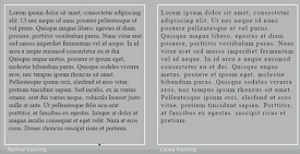
- Flush Text: Mirrors the asymmetry of handwriting, starting each line at the same point and maintaining consistent spacing between words, creating an even gray value.
- Center: This format brings symmetry to the text, giving equal value and weight to both ends of each line. It transforms the text into shapes, adding a pictorial quality. Due to its strong shape, it's important to adjust line breaks to avoid a jagged appearance.
- Flush right: This format emphasized the end of a line and is useful in situation (like captions) where the relationship between text and image may be ambiguous without a strong orientation to the right.
- Justified: This format imposes a symmetrical shape on the text by adjusting the spaces between words and letters. The resulting openness of lines can sometimes create "rivers" of white space running vertically through the text, so careful attention to line breaks and hyphenation is needed.
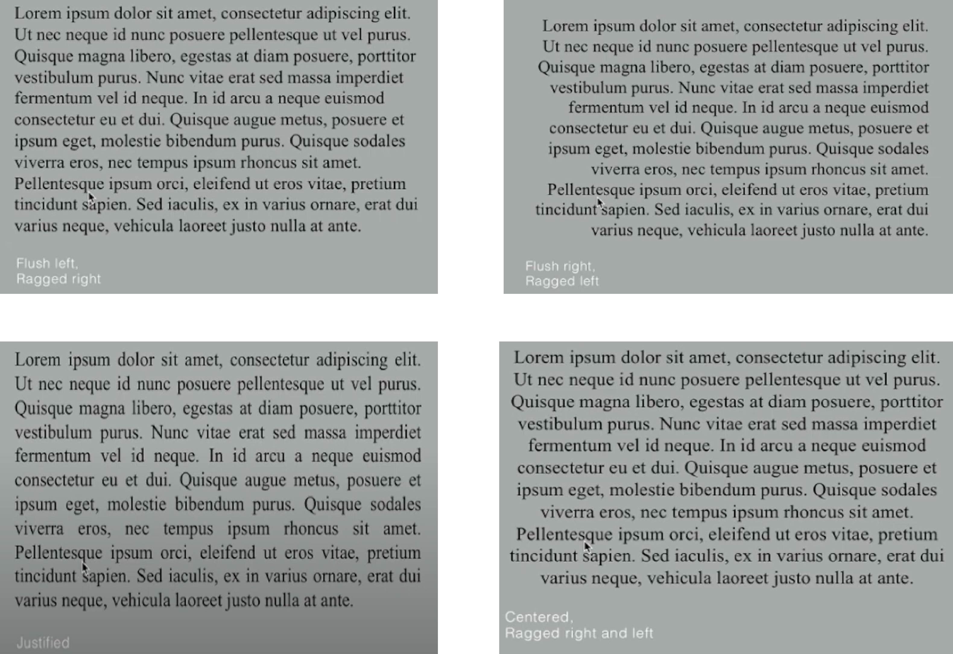
Figure 1.8 Formatting Text
- Typefaces with a larger x-height or heavier stroke will appear darker on the page, while those with a smaller s-height or lighter stroke will appear lighter.
- There is more readability if the x-height is a bit more larger in proportion to the ascender and descender.

- The goal of typesetting is to make reading easy and prolonged.
- Type size should be readable at arm's length.
- Leading should be moderate, avoiding being too tight or too loose.
- Line length should be between 55-65 characters to ensure a comfortable reading experience.
- A type specimen book displays typefaces in various sizes, helping people make informed font choices. It provides accurate references for font, font size, leading, and line length.
- Text should create an area that occupies a page or screen, with the ideal text having a middle gray value rather than a series of stripes.
- Zooming to 400% helps observe the relationship between descenders and ascenders, while one-point leading differences are hard to see at 100%. Actual printouts are irreplaceable, and screen judgements are accurate only when designing for screens.

- The pilcrow originated from medieval manuscripts and was used to indicate the beginning of a paragraph.
- Line Spacing refers to the vertical space between two lines of text, typically measured in points (pt).
- When the line spacing is set to 12pt, the paragraph spacing is also 12pt to ensure consistent alignment across different columns of text.
- In typesetting, the standard indentation is typically the same size as the line spacing or equal to the point size of the text.
- Indentation is best use when the text is justified.
- Despite the fact that extended paragraphs may result in unusually wide text columns, there may be important compositional or functional reasons for choosing this format.


- A widow is a short line of type left alone at the end of column of text
- An orphan is a short line of type left alone at the start of new column
- Widows and orphans are serious gaffes in justified text. Although flush right and ragged left text is somewhat more forgiving towards widows, orphans remain unacceptable.
- The only solution to the widow issue is to rebreak the line endings throughout the paragraph to ensure that the last line of any paragraph does not appear noticeably short.
- Orphans need more attention, make sure that no column of text starts with the last line of the previous paragraph.
- When do kerning and letterspacing to solve orphans or widows, make sure to do not do it more than 3 times.
- There are several effective ways to highlight text, including using italics, bolding it by increasing the weight or changing the typeface within the same family, altering the typeface entirely while bolding it, changing the color (keeping in mind the limits of black, cyan, magenta, and yellow for color printing), or enclosing it in a box for emphasis.
- Place typographic elements outside the left margin (extending) to maintain a strong reading axis when necessary.
- Quotation marks can create a clear indent, breaking the left reading axis.
- Prime is not a quote, basically indicate feet and inches.


- The heads (A,B, and C) clearly indicate their relative importance within the text and their relationship to each other.
- 'A' head indicates a clear break between the topics within a section. It is typically set larger than the text, in small caps, and bold. One example extends the 'A' head to the left of the text.

- 'B' heads are subordinates to 'A' heads. They indicate new supporting argument or examples of the topic.
- 'B' heads should not disrupt the text as noticeably as 'A' heads.
- Examples of 'B' head formatting include: small caps, italics, bold serif, and bold sans serif.

- 'C' heads though uncommon, highlight specific facets of material within 'B' head text.
- 'C' heads do not significantly interrupt the reading flow.
- 'C' heads formatted similarly to 'B' heads, including small caps, italics, bold serif, and bold sans serif.
- 'C' heads followed by at least an em space for visual separation.

5. Cross Alignment
- By cross-aligning the titles and descriptions with the text type, the structure of the page can be enhanced.
- Cross alignment helps to show a complementary vertical rhythm.
- In this example, four lines of description text ( with 9 pts line spacing) are cross-aligned with three lines of text type ( with 13.5 pts line spacing).
- One line of title is cross-aligned with two lines of text.
- Four lines of title are cross-aligned with five lines of text ( on the right; bottom left).
- Typography employs a number of technical terms.
- x-height: The height in any typeface of the lowercase ‘x’.
- Below baseline is descender height, the middle section between the Median line and the base line is x-height. Above is cap height and above is ascender heights.
- Stroke: Any line that defines the basic letterforms.
- Lowercase ascenders can look taller than capital letters because they extend upwards with a single stroke, while capitals are wider.
- To create the impression of equal height, ascenders are made slightly taller than capital letters, a technique known as optical adjustment.
- Apex/Vertex: The point created by joining two diagonal stems(apex above and vertex below). The top section of the letter “A” where the diagonal stems meet is called the apex. As the opposite is true with a “V” which is known as a vertex.
- Arms: Short strokes off the stem of the letterform, either horizontal ( E,F,L) or inclined upward (K,Y) is known as an arm right.
- Ascender: The strokes that exceed the median line.
- Barb: The half-serif finish on some curved stroke.
- Beak: The rounded form that describes a counter. The bowl maybe open or closed.
- Bracket: The transition between the serif and the stem.
- Crossbar: Connect to stemstroke.
- Cross stroke: The horizontal stroke in a letterform that joins two stems together.
- Crotch: The interior space where two strokes meet.
- Descender: Anything below the baseline. The stroke extending out from the main stem or body of the letterform.
- Em/ enEm originally referred to the width of an uppercase "M" but now represents a distance equal to the typeface size.
- En is half the size of an em.
- Ligature: The character formed by the combination of two or more letterforms.
- Stress: The orientation of the letterform, indicated by the thin stroke in round forms. Therefore departing from copying the diagnosed stress which was based on handwriting.


- Full font is referring to a type family.
- Uppercase Capital letters: Including certain accented vowels, the c cedilla and n tilde, and the ale and ole ligatures.
- Lowercase: Include the same characters as uppercase.
- Small Capitals: Uppercase letterforms draw to the x-height of typeface. Primally found in serif fonts as part of expert set. Most type software generates artificial small caps from uppercase letters, which are different from real small caps.

- Uppercase Numerals: Or lining figures, are the same height as uppercase letters and have uniform kerning width, making them ideal for tabular material.
- Lowercase Numerals: Or old style figures, have x-height with ascenders and descenders and are best used with upper and lowercase letters. They are less common in sans serif typefaces than in serif.

- Italic: Won't find small capitals in Italic, only Roman. Most font include matching Italics. Italics are based on fifteenth-century Italian cursive, while obliques are derived from the Roman form.
- Punctuation, miscellaneous characters: Fonts contain standard punctuation, but miscellaneous characters vary by typeface. Familiarize yourself with all available characters before selecting for a specific task.
- Ornaments: Used as flourishes in designs like invitations and are typically provided as part of a larger typeface family. Fee traditional typefaces include ornamental fonts.

- Roman letterforms are based on inscriptions from Roman monuments, and a lighter stroke version is called 'Book'!
- Italic is based on 15th-century Italian handwriting, while oblique is a slanted version of the Roman typeface.
- Boldface has a thicker stroke than Roman type and may be called 'semi bold', 'medium', ' black', 'extra bold' or ' super', with the boldest versions sometimes called 'poster'.
- Light has a thinner stroke than Roman form, with even lighter strokes referred to as 'thin'.
- The 10 typefaces represent 500 years of type design, focusing on readability and contemporary aesthetics.
- They have endured overtime, remaining in use for decades or even centuries.
- The focus should be on the differences among typefaces, which contribute to their uniqueness.
- Differences include variations in x-height, line weight, relative stroke widths, and overall feeling.
- Each variation conveys specific uses and expressions in typography.
- The letter "R" exemplifies a range of attitudes: whimsical, stately, mechanical, calligraphic, harmonious, and awkward.


- Jump : The inspiration for "Jump" came from an outdoor observation where I saw a child playing ball, and the bouncing movement of the ball gave me the idea. I designed the dot above the letter "J" as a ball and made it bounce on the letter, which effectively conveys the meaning of "jump."
- Chop: My design for "Chop" is relatively simple. A large "C" surrounds the word "hop" and chops it in half from the middle. This design is both straightforward and symbolic, effectively conveying the concept of "chop."
- Fish: The word "fish" primarily represents the scene of several fish swimming together in the same tank.
- Shake: I believe the basic meaning of "shake" is left-to-right movement. Therefore, I designed it with a gradient from the left (lighter color) to the right (slightly darker color), creating a visual effect of shaking.


- Font/s: Bembo Std Bold
- Type Size/s: 72 pt
- Leading: 60 pt
- Paragraph spacing: 0
Font/s: Bembo Std Regular
Type Size/s: 9 pt
Leading: 11 pt
Paragraph spacing: 11 pt
Characters per-line: 55-65
Alignment: left justified
- Margins: Top (123mm), Bottom/ left/ right ( 26mm)
- Columns: 2
- Gutter: 10 mm

.jpeg)


Comments
Post a Comment